Are you looking to build you first landing page?
Do you want to give your first landing page the best possible start?
Let me explain some of the best practices of how to build your very first landing page.
Landing pages are a key factor in the optin funnel process and when designed right, can help achieve great results for your business.
If you’re not entirely sure what a landing page is, it is a web page that marketers build separate to the main website that is wholly focused on achieving one goal.
This goal is most commonly to convert visitors into leads or paying customers.
If you’re building your first optin funnel, then the best thing you can invest in is a landing page.
A quality landing page can make all the difference in your conversion rate.
Take VividBoard for example, they created a landing page that turned their 2% conversion rate into 27%!
Just imagine the amount of extra revenue you could be generating from building your first landing page?
I’m hoping by now you are convinced that a landing page is what you need to make sure your optin funnel converts.
If so, let’s move onto how to design a high converting landing page, what should and shouldn’t be on your landing page and some examples of successful landing pages.
How to Design a Converting Landing Page
There are some general best practices that you can follow when it comes to building your first landing page to make sure it has the best possible start.
Once you have run your first landing page for a period of time and have set benchmark metrics will you then be able to start changing and testing different elements on that landing page to constantly increase your conversion rate?
For now, though, here are some best practices for building your first landing page:
Only Give Visitors One Action to Take
One of the first and most important things you need to consider is what goal you wish to achieve from your landing page.
Do you want visitors to sign up for your free trial?
Do you want visitors to subscribe to your newsletter?
Do you want visitors to download your eBook?
Whatever it is, make sure that you only have one action on your landing page.
Giving visitors too many options on the landing page will only lead them to become distracted which will result in a low conversion rate.
[”Your landing page should be focused on one action and directing visitors to take that action.” username=”ClickFunnels”]
Add Visuals to Your Landing Page
It is all too easy for visitors to bounce from your landing page seconds after landing on it.
This is usually the case when there is no eye capturing visuals on the landing page.
When designing your landing page, think about how you are going to get the visitors attention.
This could be like a video or a relevant and bold image.
You have just a few short seconds to capture their attention so that they stay on the landing page and convert so use it well.
This doesn’t just count for the video/image on the landing page either.
The whole design of the landing page should be clean and consistent.
Think about what colors you will use to highlight actions and where important elements of the landing page will be placed.
Don’t Ask for Too Much Information
After visitors are convinced they want to remain on the landing page, they are now more than likely wanting to find out more information or sign up for your free trial.
The one thing that will stop them from doing this at this point is if you ask for too much information from them on the contact form.
If that visitor already has a slight doubt in their mind, asking for too much information will trigger that doubt and stop them from converting.
When designing your first landing page, think about what information is necessary for you to nurture a lead, not what information you want.
Once your first landing page has been running a while, you can then test adding and removing fields from the contact form to see which results in the higher conversion rate.
For now, though, only add fields to your contact form that are necessary.
Don’t Talk About Yourself
One of the most common mistakes businesses make with their landing page is they talk too much about themselves and not about what they or their product can do for customers.
People don’t want to know about you, they want to know about how you can help them solve their problems and achieve their goals.
For this reason, it is best to highlight the benefits of your product rather than its features.
You can use your customer avatars to target their pain points on your landing page and offer a direct solution.
What Should and Shouldn’t Be on Your Landing Page
You should now know the best practices when it comes to building your first landing page.
However, you don’t yet know exactly what elements should and shouldn’t be on your landing page.
Here is a list of important elements that need to be on your landing page:
- A compelling headline
- A short description of your product or offer
- Bullet points to highlight the benefits of the product or offer
- Image or video that will capture the eye of the visitor
- Testimonials and brand logos to instill trust
- A contact form that asks for necessary information
- Call to action button that will encourage visitors to take action
All of these elements will help to capture the interest of the visitor as well as direct them to take the action that will see them convert.
Now that you know what should be on your landing page let’s have a look at what shouldn’t be on your landing page.
- Navigation links are crucial for a website however they can become an unwanted distraction on a landing page. Your landing page should be a standalone page with only one action for the visitor to take.
- While having a call to action is crucial for your landing page, having too many can confuse the visitor and lead them not to convert at all. Again, only have one action on your landing page.
As a whole, make sure to keep your first landing page clean and free of clutter.
Don’t overthink it too much at this stage as you can test and optimize later on.
Keep it simple to begin with and add the crucial elements to make it convert.
Examples of High Converting Landing Pages
Now that you know landing page best practices and what elements should and shouldn’t be on your landing page, let’s take a look at how it should be done.
Sometimes the best way to explain what a successful landing page should look like is to show it in action. Here are some of the top landing pages I have come across:
ViziCities
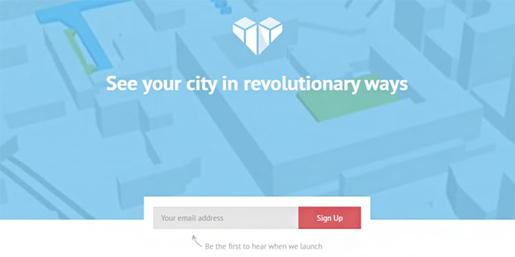
ViziCities have managed to keep their landing page free from clutter and kept it super minimalistic with a compelling headline.
Grasshopper
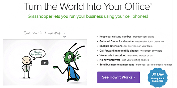
Grasshopper has really taken on board how to target pain points by talking about how they can help rather than talk about themselves.
H.Bloom
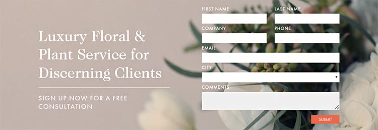
H.Bloom has truly captured the concept of using bold visuals to capture the eye of visitors.
Basecamp
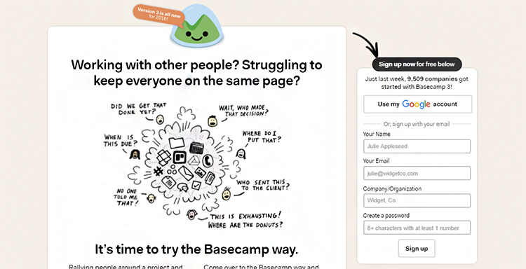
Basecamp certainly triggers pain points with this creative image on their landing page.
Kissmetrics
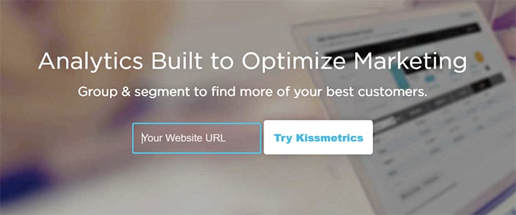
Kissmetrics have done everything right with this landing page. They have a compelling headline, simplistic design, mentioned the benefits and are only asking for one piece of information.
How to Measure the Success of Your First Landing Page
After you have finished building your landing page, there are a couple of things you will need to monitor to determine its success.
You can then use these metrics to change, test and optimize after the first run. Here are a couple of things that will help you determine the success of your first landing page:
Conversion Rate
The conversion rate is the amount of leads generated from the number of visitors who landed on your page.
This is the most important metric to monitor for your optin funnel and is the metric you will work towards improving as it has a direct result on your bottom line KPI’s.
Abandonment Rate
This is another very important metric to track; whether visitors start to fill out your contact form but then abandon it before converting.
If your form abandonment rate is fairly high, then it is a sign that your form is too long.
Time on Landing Page
This is a good metric to monitor as it will tell you whether your landing page is capturing visitors when they first land on your page.
If they are spending a few seconds on your landing page before leaving then, it is safe to say that your landing page isn’t grabbing their attention.
Conclusion
You should now have everything you need to build your first landing page so that your optin funnel converts.
Make sure to measure the performance of your landing page and set benchmark figures.
You can then continue to make changes, test and optimize to continue to work on improving conversion rates.
What has prompted you to want to build your first landing page?
Let me know by leaving your comments below.

How do I set up my landing page optin form with clickfunnels to NOT show the landing page of a prospect who has already provided me with his or her information from a previous visit?
Your landing page won’t include the past prospect’s information, it’s empty for every new prospect that comes through.
Do you have any landing pages that I can see for someone who sells video production services?
Thank you for this information. It helped me a lot.